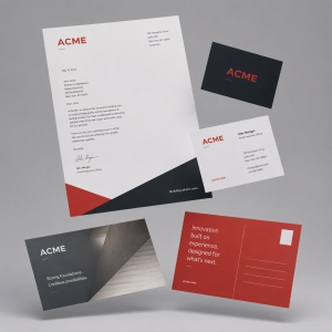
In a world saturated with digital noise, we encounter thousands of marketing messages every day. We scroll past them, delete them, and tune them out. But when a prospective client walks to their mailbox, the rules of engagement change entirely. The moment their hand touches your mailer, a physical and psychological process begins.
This is called Haptic Perception, a well-established concept in Product Design and User Experience Research, particularly within the field of Human-Computer Interaction (HCI), where designers study how the sense of touch shapes the way we process and remember information. But these principles don’t stop at digital interfaces. Physical product brands have long applied haptic thinking to their campaigns and in a crowded mailbox, that same science gives your print the edge that a screen never can.
The Ownership Effect: Why Physical Mail Holds Attention
Neuromarketing research shows that physical objects trigger a sense of “psychological ownership.” While your website provides essential information and an interactive experience, a high-quality tactile mailer creates a physical connection that screens cannot replicate. When a customer holds your piece, their brain begins to treat the message with a different level of permanence than a flickering pixel.
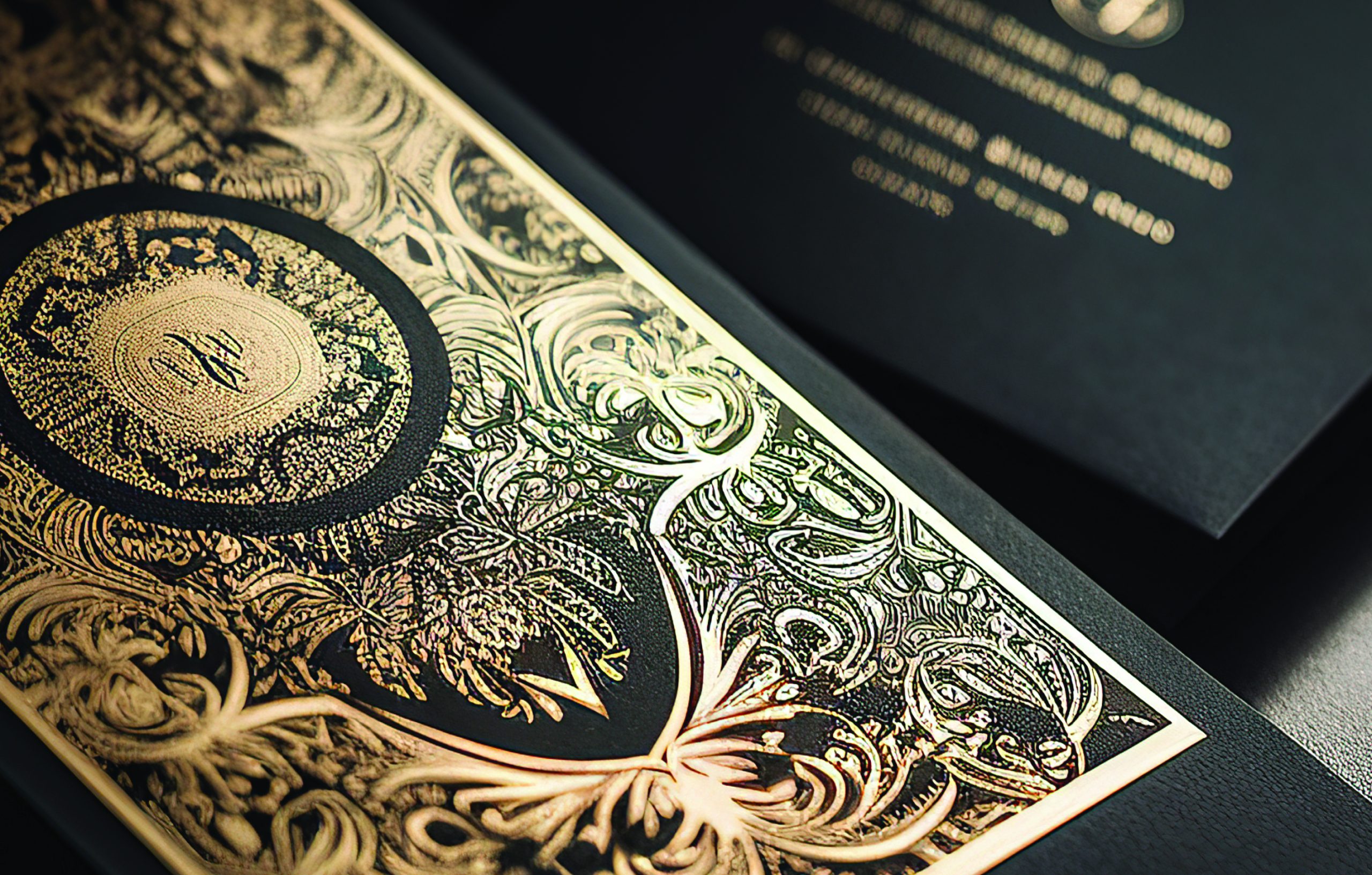
At Marketing Tech of WNY, we use advanced embellishment technology to create exactly this effect. When a recipient feels the unique laydown of specialty inks or the subtle dimension of clear effects, their brain sends an immediate signal to pay attention — and to keep the piece.
Strategic Specialty Inks: Matching Texture to Brand Intent
Precision in printing means choosing finishes that reinforce your brand identity in the physical world. With our Iridesse production capabilities, we help you select the specialty inks that fit your specific business goal:
Metallic Gold & Silver — The Authority Finish
Perfect for VIP invitations, high-stakes corporate announcements, or nonprofit donor appeals targeting major gift levels. Unlike standard CMYK, true metallic inks catch the light and signal high value, elevating your brand above the competition before the reader has processed a single word.
Dimensional Clear Ink — The Subtle Reveal
Clear ink adds a “spot” texture to patterns, logos, or key messaging. It creates a tactile contrast that encourages the recipient to run their fingers over the piece increasing dwell time and brand engagement in a way no digital ad can achieve. The more time someone spends physically interacting with your mailer, the more likely they are to act on it.
White Ink on Dark Stocks — The Bold Distinction
Printing crisp white ink on heavy, dark cover stocks creates a striking visual and physical contrast that digital screens simply cannot replicate. It signals that your business is sophisticated, modern, and detail-oriented, the kind of organization that considers every element of its presentation. For small businesses, nonprofits, and corporate brands alike, this finish communicates that your offer is worth serious consideration.
The Weight of Credibility: Why Stock Selection Is a Trust Signal
The weight of your cover stock isn’t just about durability — it’s about trust. Research shows that people perceive businesses as more dependable and professional when their printed materials use heavier, higher-quality stocks. The physical weight of a piece transfers, unconsciously, into perceived brand weight.
Using Marketing Tech’s selection of premium cover stocks, we ensure that your 2026 campaigns don’t just look professional — they feel substantial. A flimsy flyer suggests a temporary offer. A weighted, metallic-inked mailer suggests a permanent partner. It is the physical anchor to your digital presence, and the piece your prospect keeps on the counter instead of dropping in the recycling bin.